A desktop charger sits on the desk in plain view all day, which makes it a brand surface, not just electronics. Materials, finish, color and logo placement decide whether the product looks considered or generic — and whether the brand looks premium or bargain. This guide turns aesthetics into a design process with measurable outcomes.
Why desktop chargers are brand surfaces
Unlike a phone charger hidden behind furniture, a desktop charger is visible in meetings, photos and video calls. That visibility makes it a daily brand impression: the charger's look either reinforces the brand's quality story or contradicts it. Brands that treat the charger as a design object — matching materials, finish and color to their identity — turn a utility into advertising that works while the product sits there.
A desk charger is photographed in every video call, sits in every product review and lives in the buyer's daily line of sight — a brand impression that costs nothing per impression. The OEM design process treats finish and form as part of the product spec, not decoration. Brands that invest in the aesthetic get a compounding return: consistent materials across the lineup make the brand recognizable in a category where most products look interchangeable.
Materials and finishes that signal quality
Materials communicate before anyone reads a logo: matte soft-touch plastic feels premium but shows wear; textured polycarbonate balances grip and durability; aluminum radiates quality but adds weight and cost; silicone accents add grip and color. The finish — matte, gloss, anodized, painted — sets the perceived value. The right combination for a desk product is durable and tactile: it should look good on day one and still look good after a year of daily plugging.
Material choice is a cost-and-perception trade: matte finishes hide fingerprints but can look cheap without good texture; gloss signals premium under light but shows every smudge; aluminum signals quality but adds weight and cost. The finish durability research that applies to industrial surfaces applies here too — wear reveals quality faster than the first impression. Designers should pick the finish that survives the desk, then verify it with physical samples before tooling.
The finish decision is also a manufacturing quality question: tooling texture, paint adhesion and assembly handling all affect whether the finish survives production, and the design durability testing used for industrial surfaces applies here. The USB-C product category is crowded with look-alikes, so the finish is often the only differentiator a buyer can see — it deserves the same engineering attention as the power stage, guided by the power supply design references that define the electrical side.
Matching charger colors to devices and packaging
Color matching is a systems decision: the charger should sit with the brand's laptops, phones and packaging, not clash with them. Neutral finishes (black, white, gray) match every device ecosystem; color accents align with brand identity; full-color runs make the charger a statement piece. The practical tool is a color standard — define the exact finishes per SKU and match them against the devices the charger will sit next to.
Logo placement and minimal branding
Logo placement follows a hierarchy: on the top surface for visibility, on the side for subtlety, or embossed in the material for permanence. The rule for premium products is restraint — one logo, correctly placed, in the right finish. A logo that competes with the product's own design cheapens both. For private-label programs, logo placement should be specified in the design brief with exact dimensions and finishes.
Logo placement is a geometry problem with a marketing answer: the top surface is the visible position on a desk, the side is the subtle position, and the embossed-in-material position is the premium one. The finish of the logo matters as much as its position — a painted logo on a matte surface wears differently than an embossed one. For private-label programs, the placement spec belongs in the design brief with exact dimensions, finish and tolerance, because every brand has an opinion and the brief settles them before tooling. Restraint is the rule: one logo, correctly placed, in the right finish.
Designing a charger family across SKUs
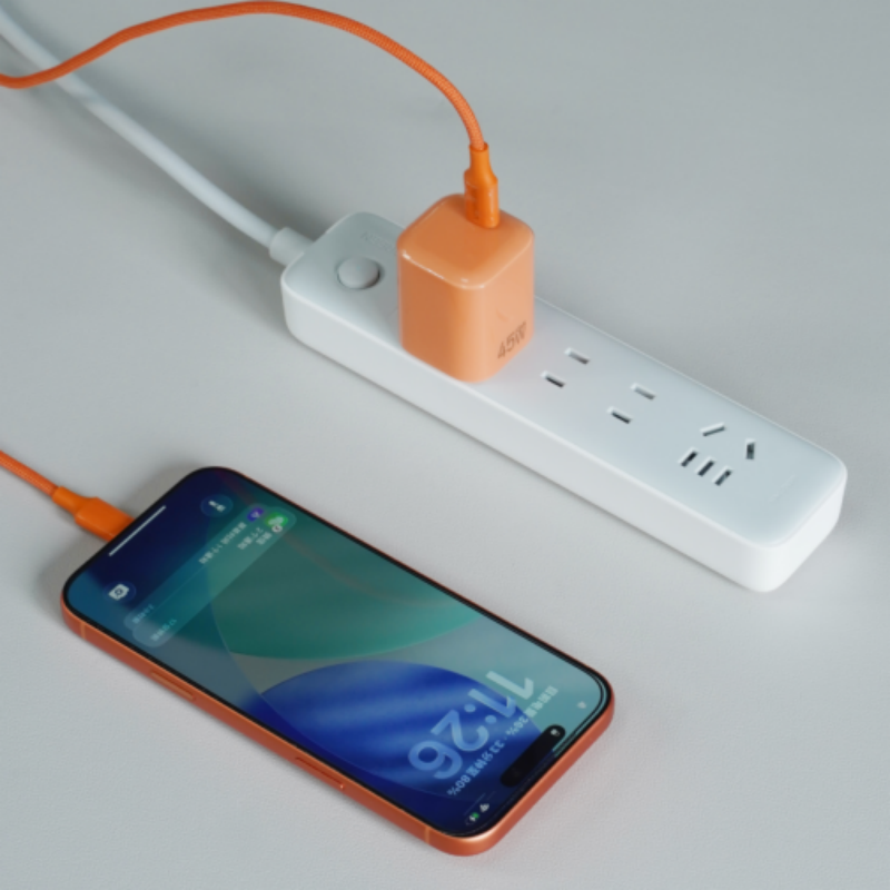
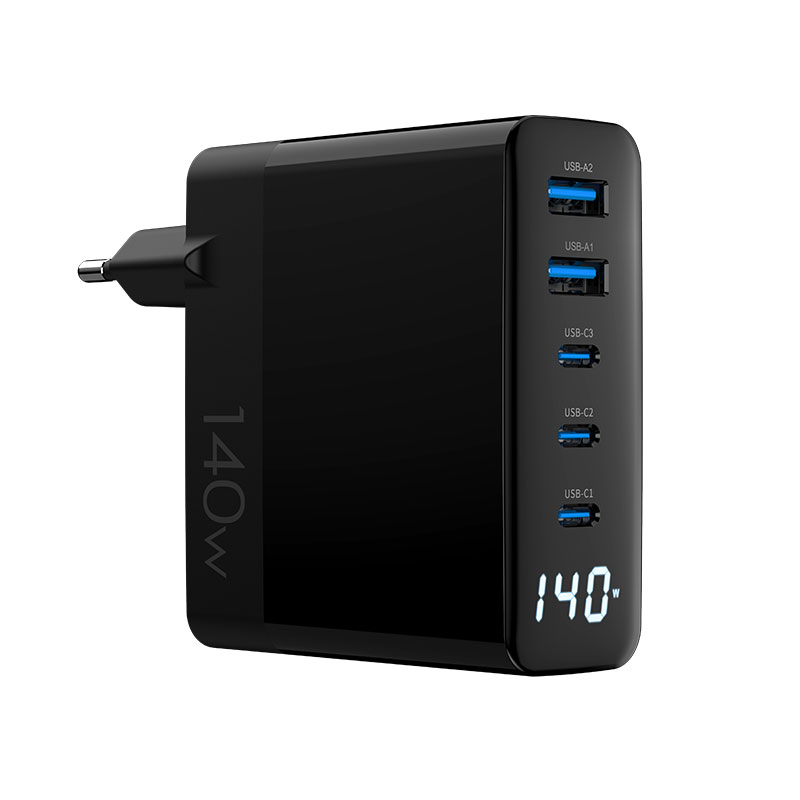
A charger family is one design language across wattage tiers: the same material, the same finish, the same logo position, with size scaling as the only differentiator. Consistency makes the family recognizable and simplifies the brand's industrial design — and documented products that meet energy-efficiency programs reinforce the premium story at the compliance level too. The 45W Cosmic Orange charger and the WEG-140W-2A3C 140W hub show how one language can stretch across a lineup.
Turning aesthetics into product-line strategy
Aesthetics become strategy when they segment the line: a budget tier in standard black, a mid tier in branded colors, and a premium tier in exclusive materials. Each tier's finish should match its price position — a premium-priced charger in a cheap finish destroys the margin story. The aesthetic strategy should be written down, with a finish per tier, so every SKU reinforces the position.
Texture and finish samples before tooling
Never approve finishes from renderings: request physical texture and finish samples, in the production material, before tooling. Renderings flatter gloss and hide texture; samples reveal fingerprints, scratches and wear. Test the sample's feel in the hand and its look under office lighting. The sample stage is where aesthetic decisions get made cheaply; after tooling, every change is expensive.
Color matching against device ecosystems
Color matching should happen against the actual devices: place the charger next to the brand's laptop and phone, and check the match in daylight and office light. Neutral finishes match everything; a "black" that is actually dark gray will be noticed next to a true black laptop. For OEM programs, define the color with a standard reference (Pantone or a physical chip) so the factory reproduces it exactly.
Unboxing and first-impression design
The first impression is the unboxing: packaging material, insert design, the charger's first reveal and the logo placement all set the perceived value before the product is used. A premium charger in a thin plastic bag contradicts itself; a simple, well-printed box with a fitted insert completes the story. The unboxing design belongs in the same brief as the charger's finish, not added afterward.
Aesthetic consistency across price tiers
Consistency across tiers keeps the brand legible, but the tiers should not look identical — a budget charger in the premium finish undersells the premium product. The rule is one design language, three finish levels: standard, branded and exclusive. The language carries the brand; the finish carries the price.
Testing finish durability in daily use
Finish durability is a testable spec: a wipe test with common cleaners, a scratch test with keys and bags, a fingerprint test on glossy surfaces, and a UV test for color fade on sunny desks. Each test produces a pass/fail that goes into the design review. A beautiful finish that fails the daily-use tests becomes a returns driver; a durable one becomes a repeat-purchase reason.
Durability testing turns aesthetic opinion into data: wipe tests with common cleaners, scratch tests with keys and bags, fingerprint tests on gloss surfaces, and UV tests for color fade on sunny desks. Each test has a pass/fail that belongs in the design review — and the results should be shared with the buyer who will live with the product. A finish that passes the tests supports the premium price; one that fails becomes the returns driver. Certified charger families document their finishes for exactly this reason.
FAQ
How important is the look of a desktop charger?
Very — it is visible all day on the desk, in meetings and on camera, so it is a daily brand impression. Materials, finish and color shape perceived quality before anyone reads a logo.
What materials make a charger look premium?
Matte or textured finishes, aluminum where weight allows, and consistent color standards. The finish's durability matters as much as its initial look.
How do I make a charger family look consistent?
Use one design language — same material, finish and logo position — across wattage tiers, with size as the main differentiator. Consistency makes the lineup recognizable.
Should I approve finishes from renderings?
No — request physical samples in the production material before tooling. Renderings flatter gloss and hide wear; samples reveal the truth.
Designing a branded desktop charger line? Send your brand identity and target tiers to our team through the contact page — we can produce finish samples and build the family across wattages.
This article is part of Desktop & Multi-Port Charging, the guide that covers this topic in decision order.